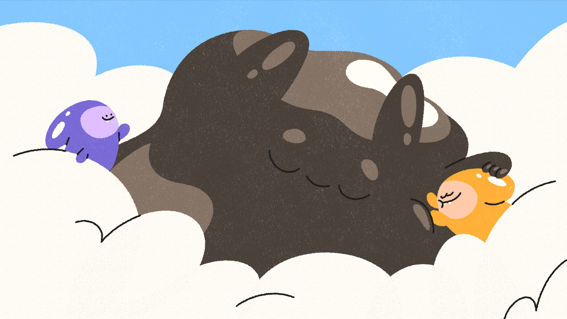
古溜!Q彈!可愛!
客戶的需求既然如此,那有什麼問題辣
太讚ㄌ我們也最喜歡可愛的東西
客戶的需求既然如此,那有什麼問題辣
太讚ㄌ我們也最喜歡可愛的東西
Cute! Bouncy! Adorable!
Since that’s exactly what the client wanted, we're all in. We love cute things.
Since that’s exactly what the client wanted, we're all in. We love cute things.
因此從最一開始的腳本到分鏡,就持續思考什麼樣的設計最能讓四個 Q 彈的生物表現出它們的 Q 彈可愛。
最終決定建立一個療癒的溫馨世界,將重點著重在表現他們的 Q 彈與可愛抖動,同時也保有後續更多製作的可能性。
例如不同地點、不同季節、不同節日等,共通點為都可以抖動、彈跳,整體可愛療癒。
From the very first script to the storyboard, we kept exploring how to design these four bouncy little creatures so their soft, jiggly cuteness could really stand out. We continuously asked ourselves what visual approach would best bring out their charm.
Eventually, we decided to create a warm and soothing world that highlights their bounce, their playful wiggles, and their overall softness. This direction also allows plenty of room for future production possibilities.
Whether it’s different locations, seasons, or holidays, the common thread is that they can always jiggle and bounce. This keeps the entire experience consistently cute, lively, and delightfully comforting.


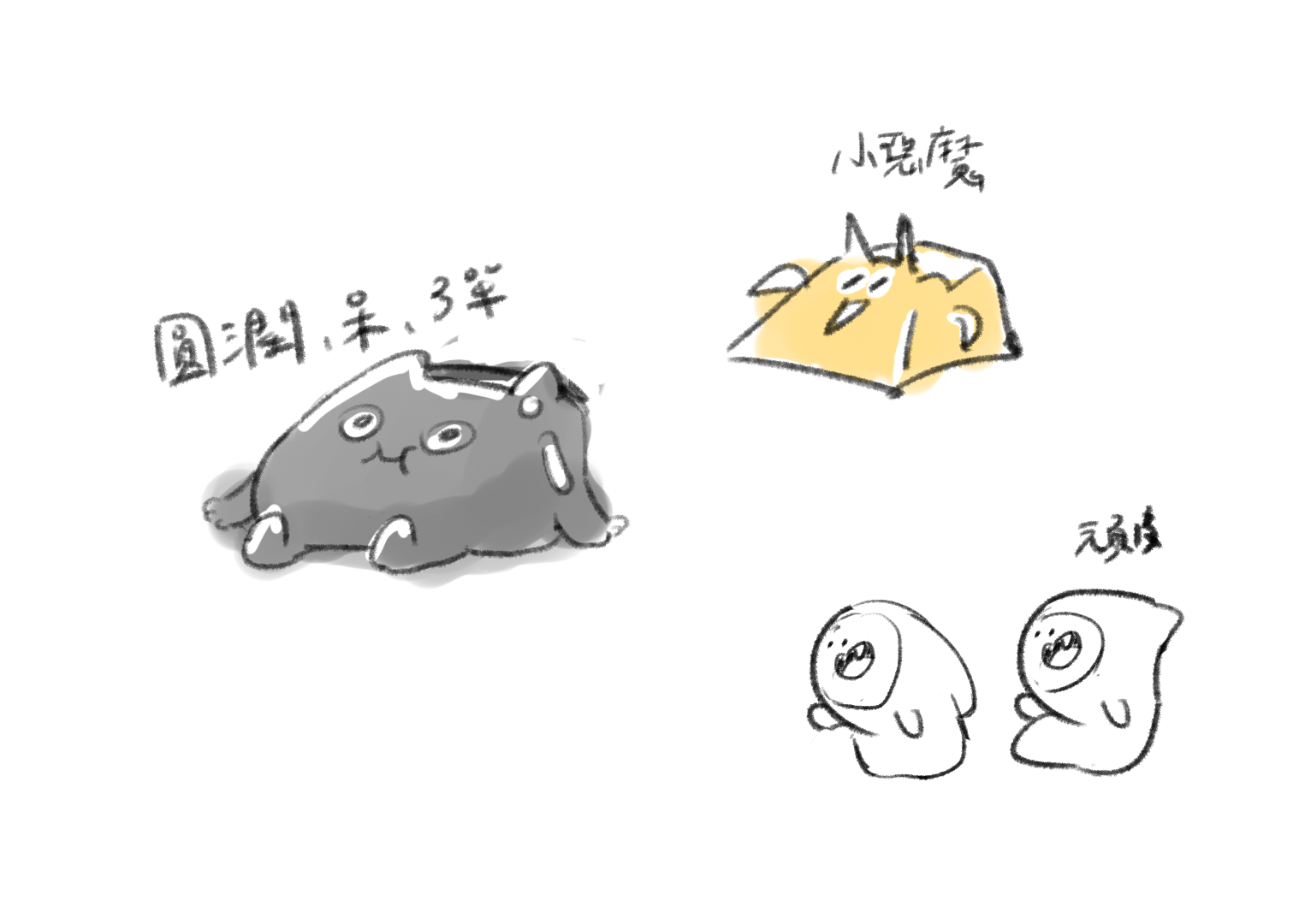
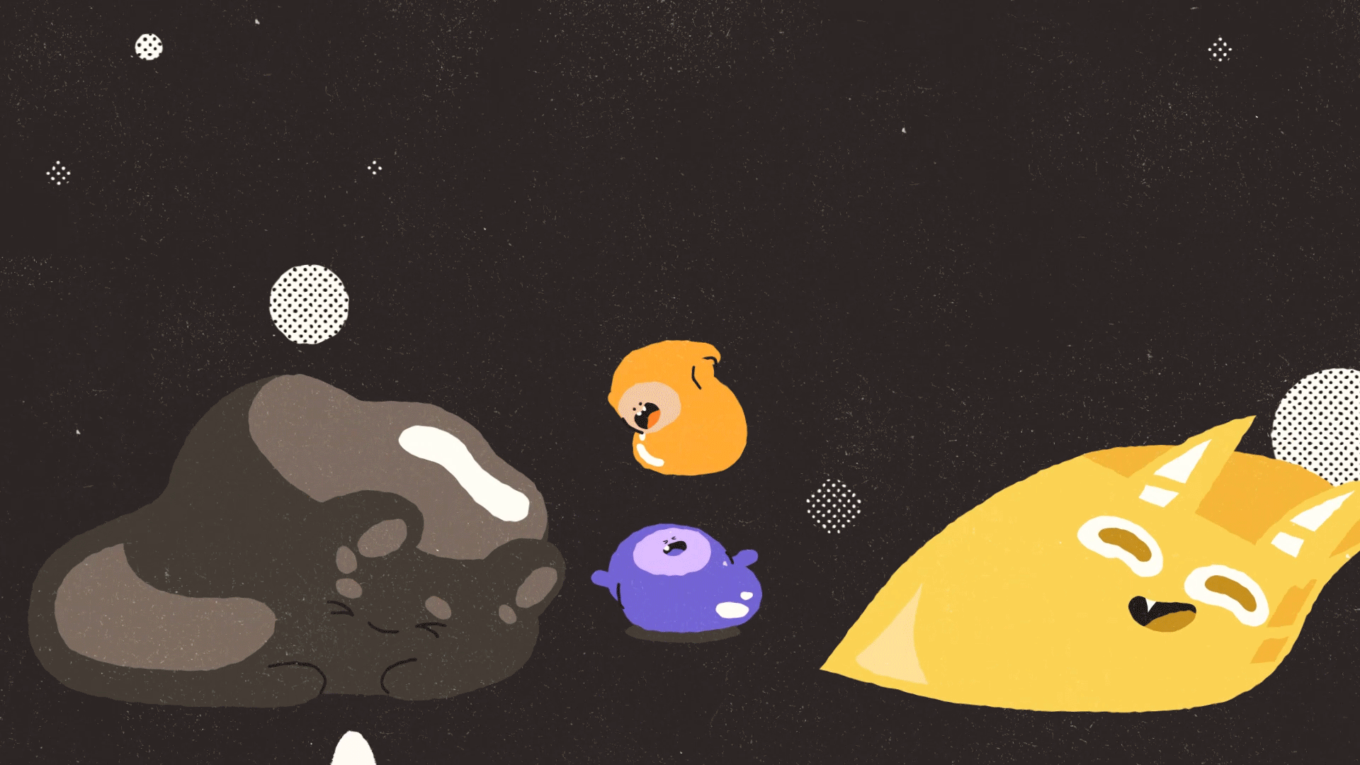
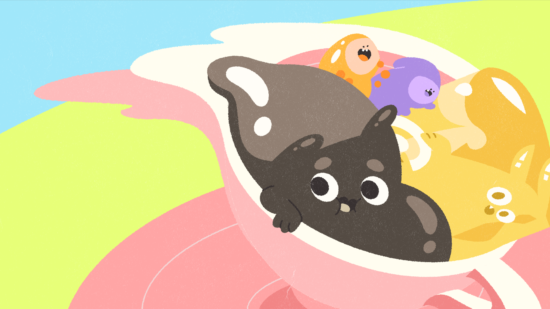
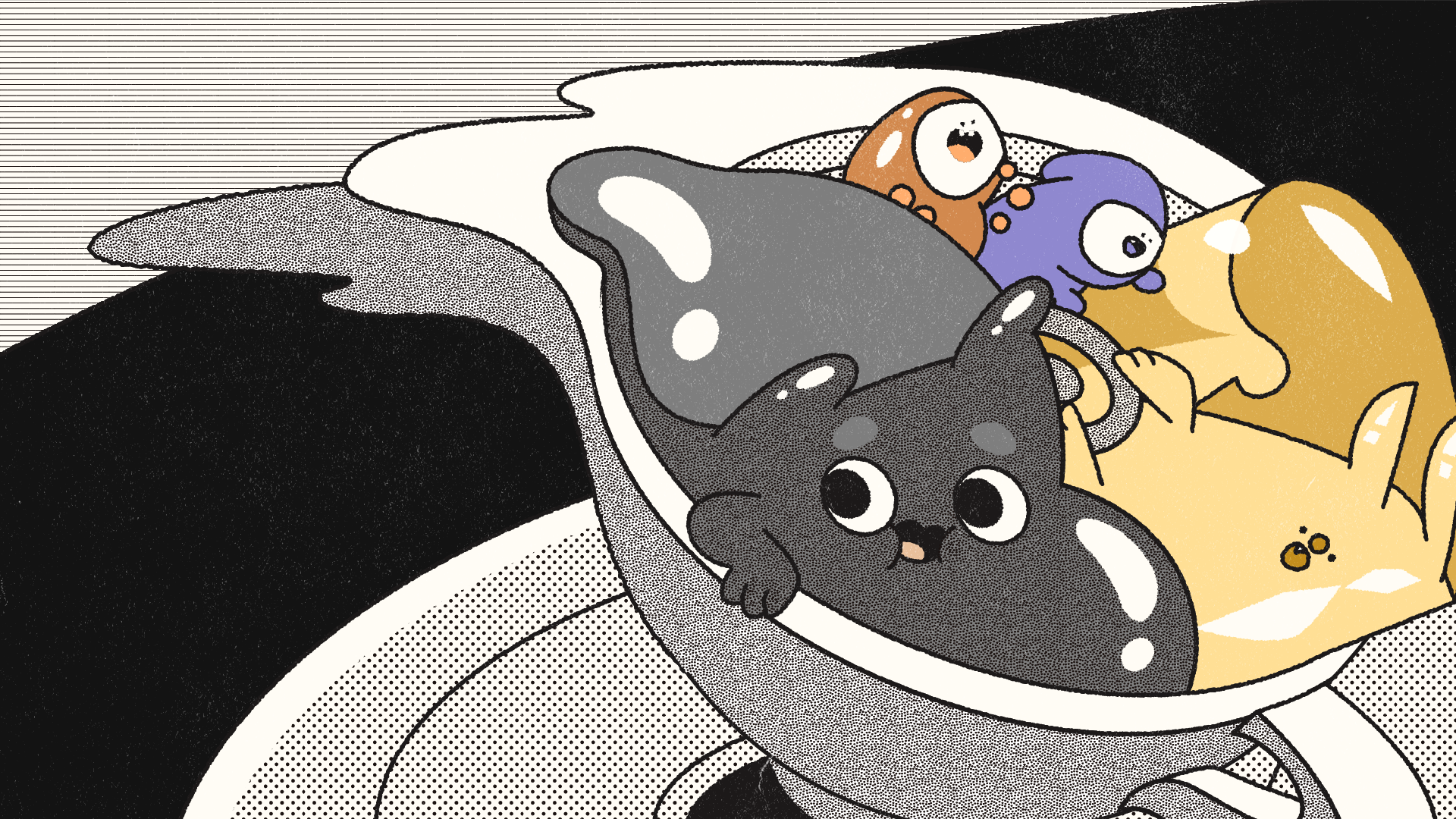
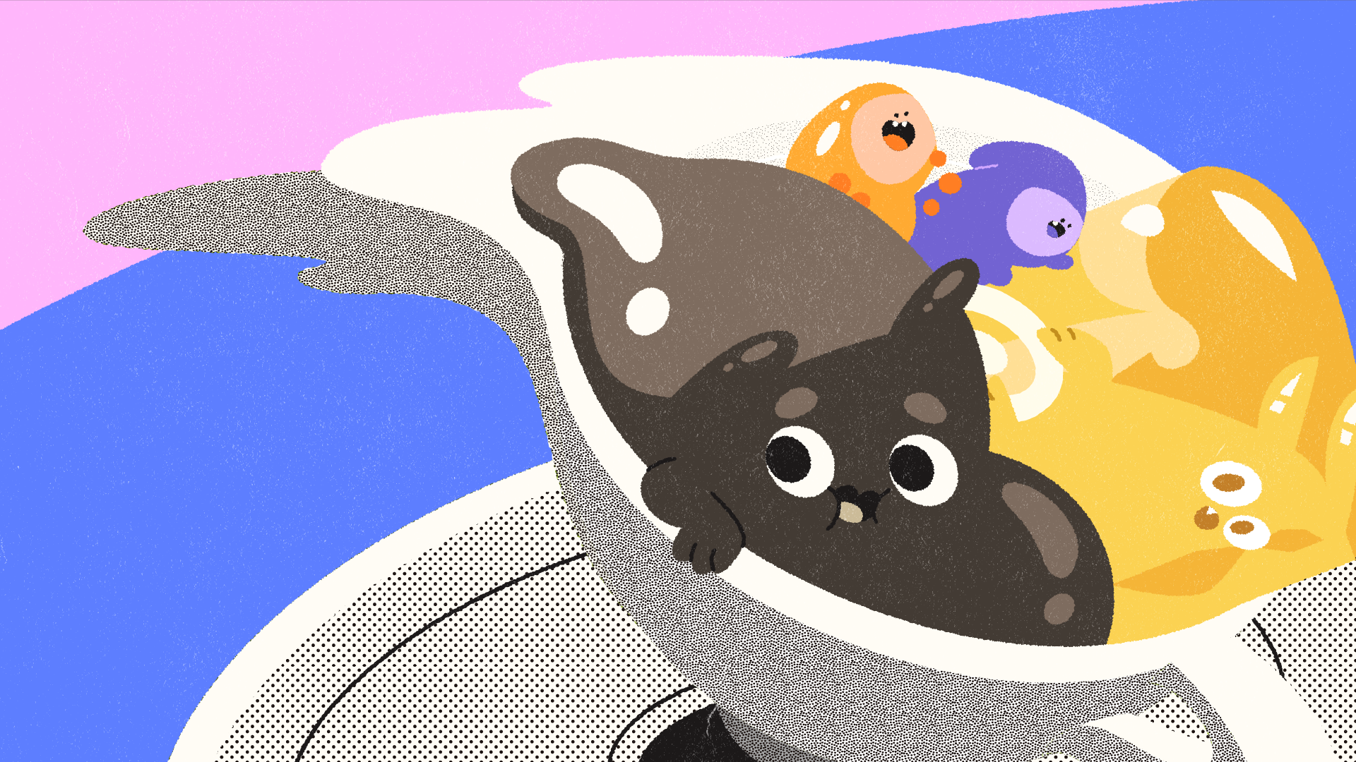
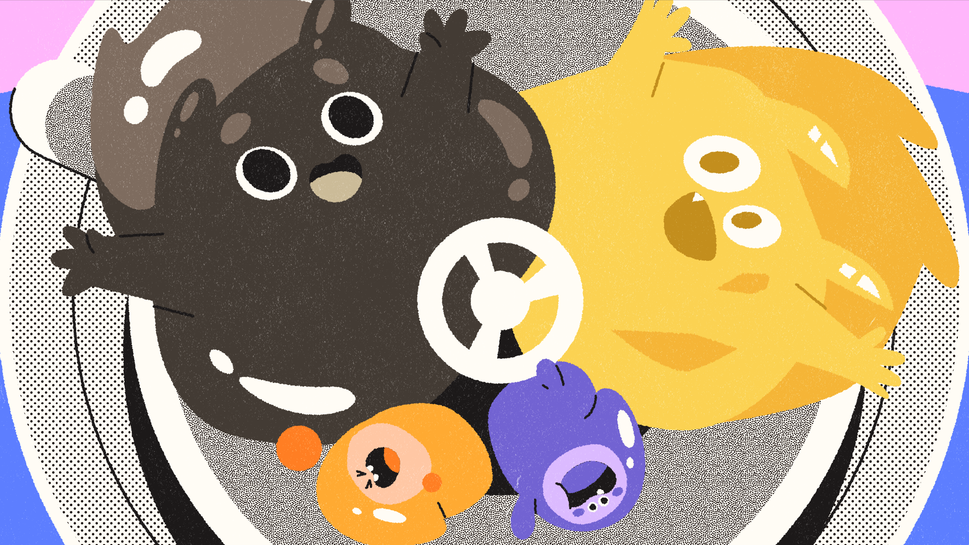
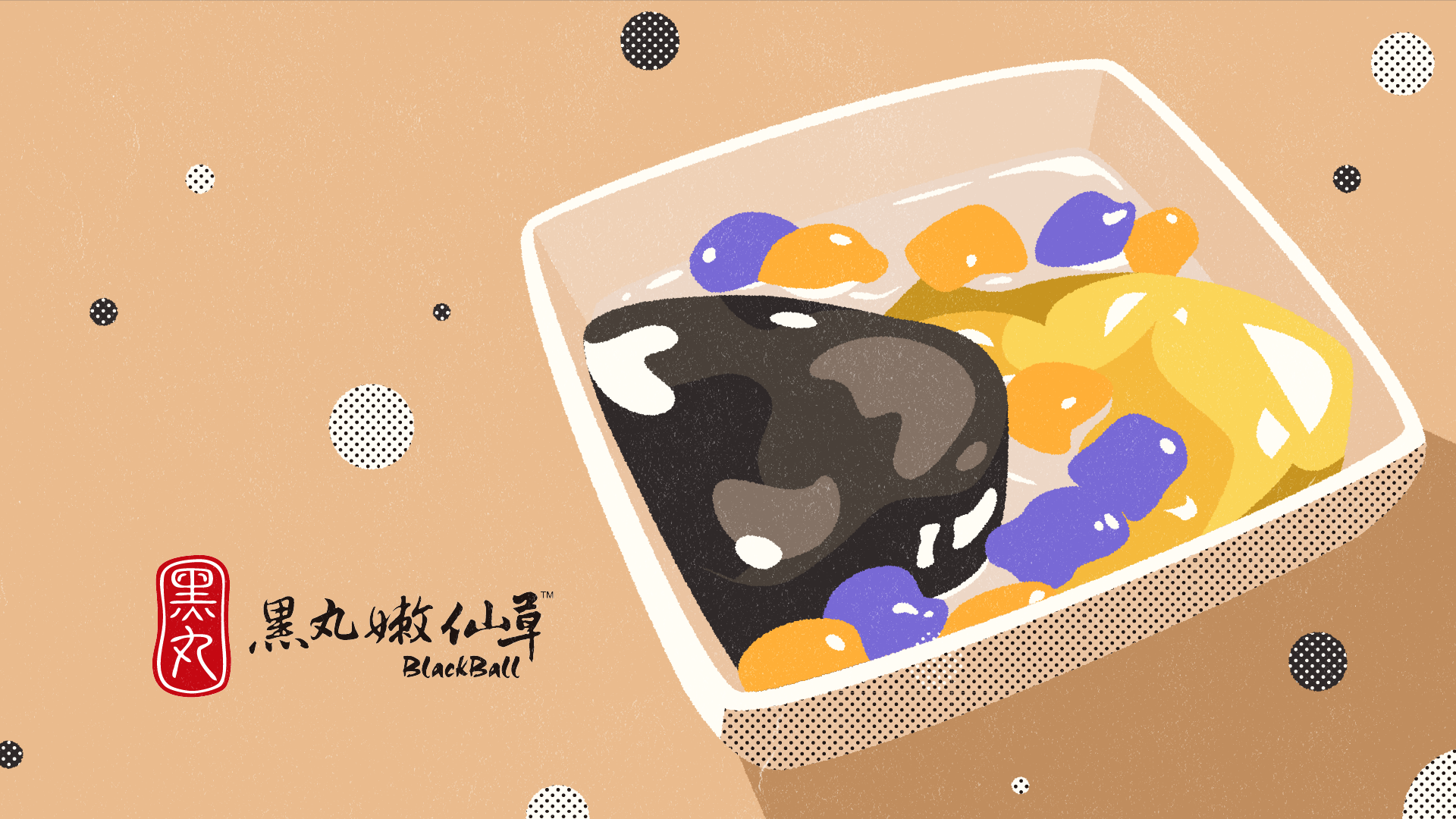
分別取黑丸嫩仙草最主要的四種人氣配料:仙草、愛玉、地瓜圓、芋圓為主角。
首先發想各自的個性再以此為依據設計各自的造型。
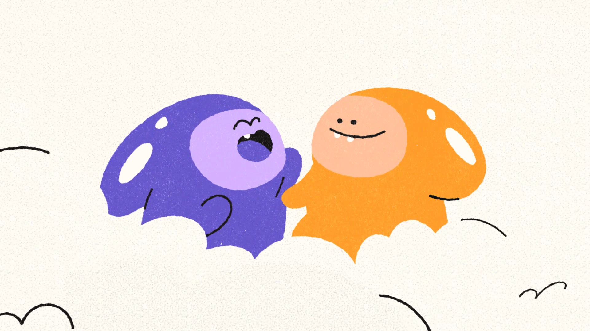
仙草:較圓潤、呆萌可愛的角色
愛玉:稜角較多較為活潑外向、如小惡魔般喜歡惡作劇
地瓜圓、芋圓:如雙胞胎般頑皮打鬧,可以因為一點小事笑個不停的混亂小可愛。
We based the characters on the four most popular toppings from BlackBall:
grass jelly, aiyu jelly, sweet potato mochi balls, and taro mochi balls.
Each one was developed as an individual protagonist within the world.
We started by defining their personalities, then designed their visual forms around those traits. This ensured that each character’s look and behavior felt cohesive and intentional.
Grass Jelly is rounder and softer, a slightly clueless but irresistibly cute character.
Aiyu has sharper angles and a livelier, more outgoing personality—playful and mischievous, almost like a tiny troublemaker.
Sweet Potato and Taro Mochi Balls act like chaotic little twins: always teasing, always laughing, and able to find endless joy in the smallest things.

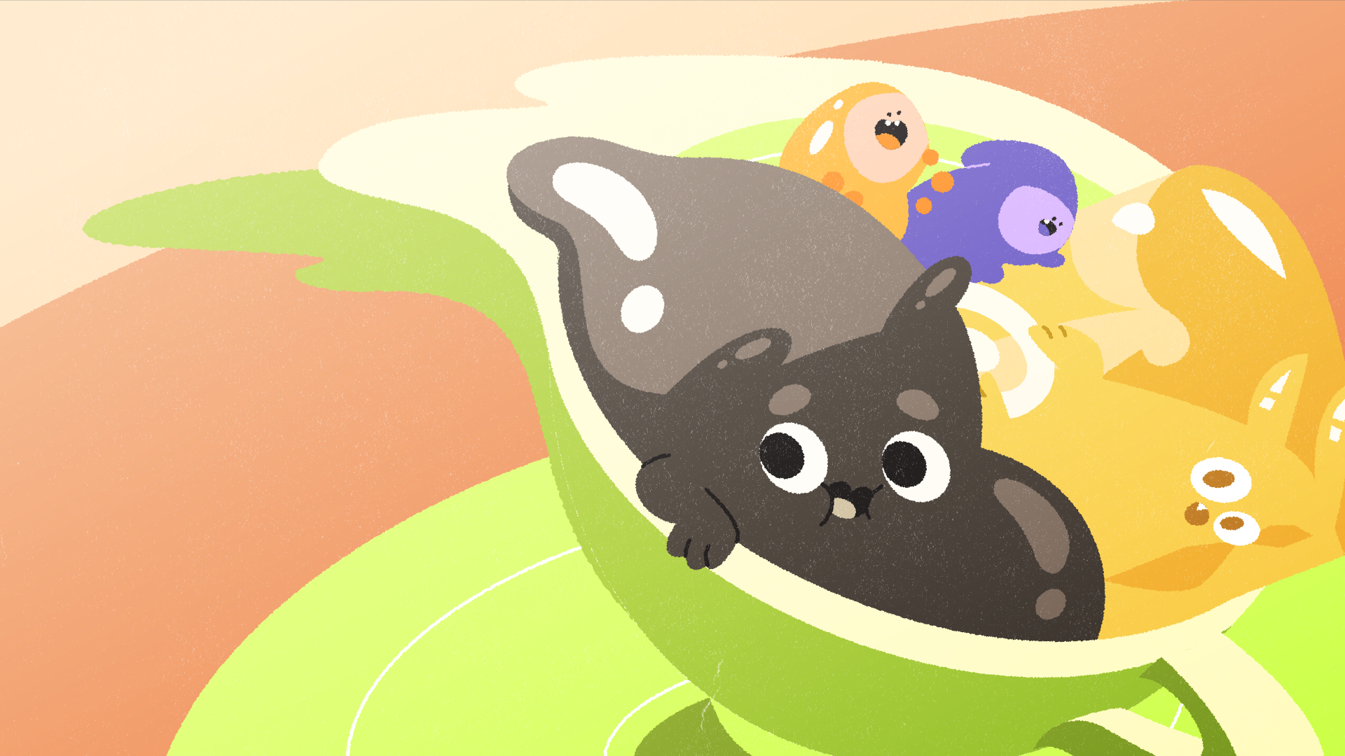
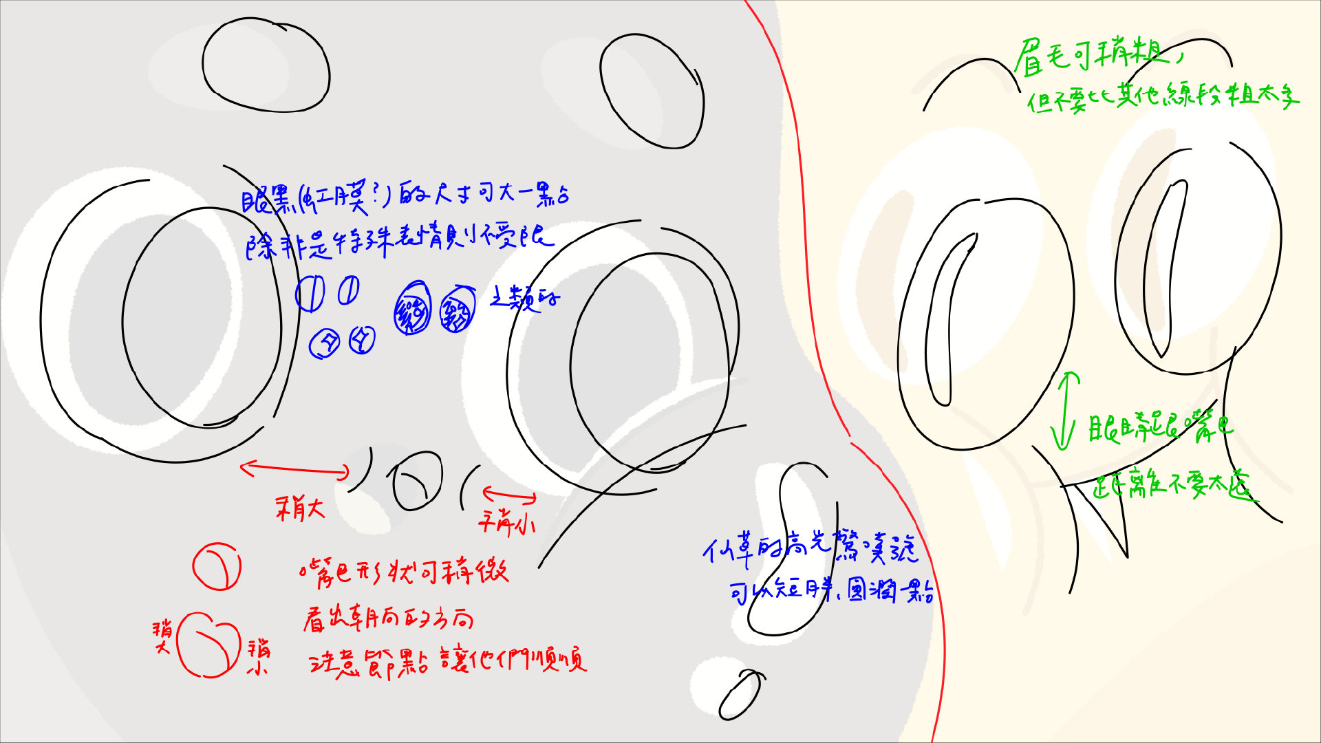
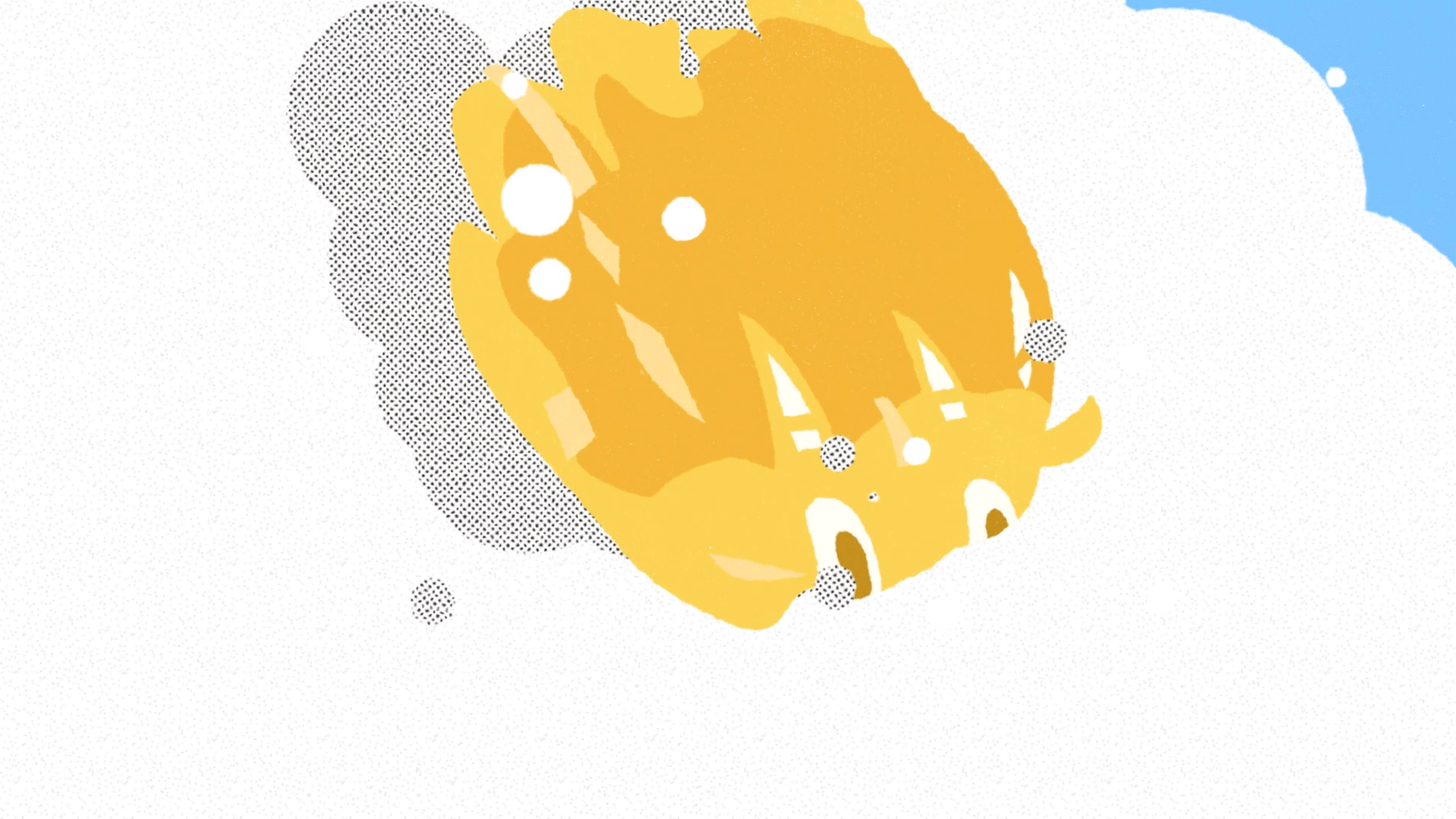
經過各種測試,嘗試找出最符合品牌的色調。
同時考量怎樣的美術可以最適合動態表現,目標是呈現出滑順、Q 彈感。
最終決定以明亮、高彩度的簡約幾何造型,並使用網點加強細節,營造大人小孩都愛的活潑可愛俐落氛圍,充滿活力並容易強調出滑嫩剔透感。
After running various tests, we explored a range of color directions to find the palette that best aligned with the brand’s identity. The goal was to capture a tone that felt both energetic and unmistakably on-brand.
At the same time, we evaluated which visual style would work best in motion, focusing on how to express smoothness, bounce, and that signature jiggly quality through animation.
In the end, we chose a bright, high-saturation geometric style, enhanced with halftone textures to bring out finer details. This approach creates a lively, cute, and clean atmosphere that appeals to both kids and adults, while also highlighting the glossy, soft, and slightly translucent look of the characters.

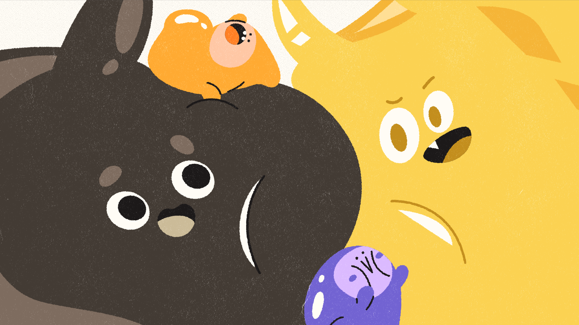
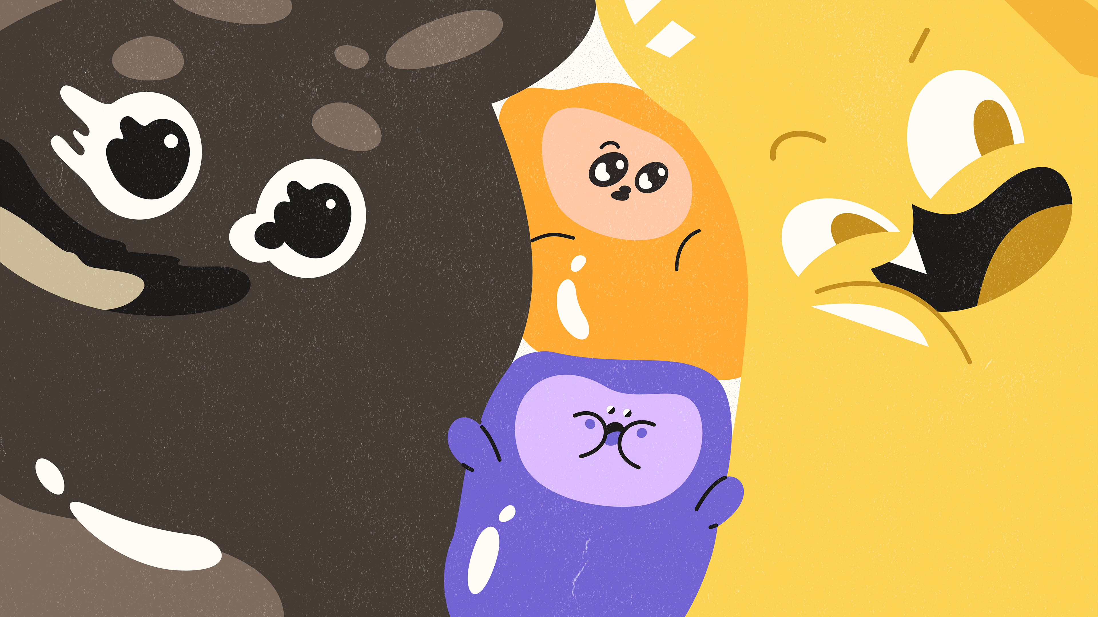
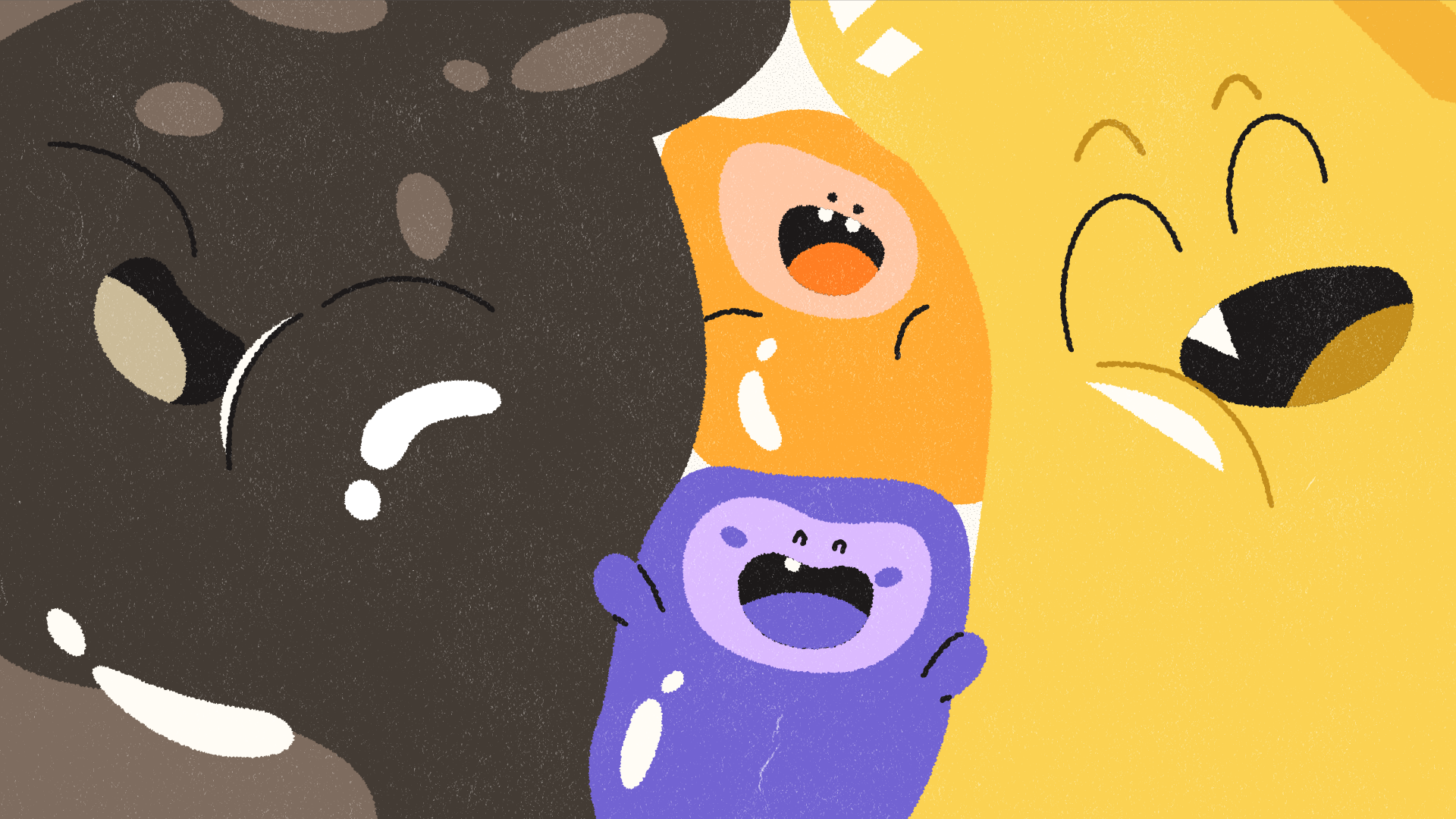
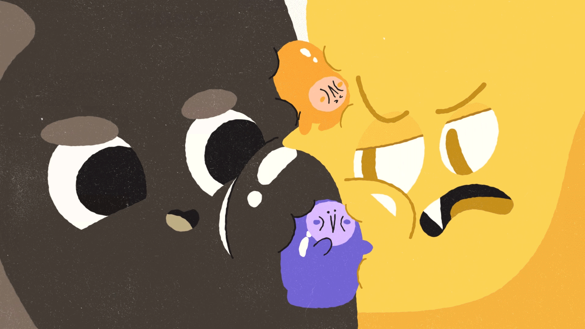
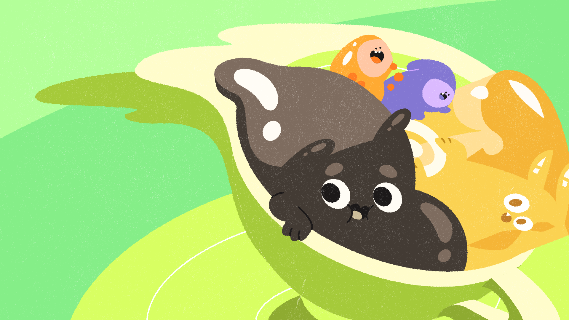
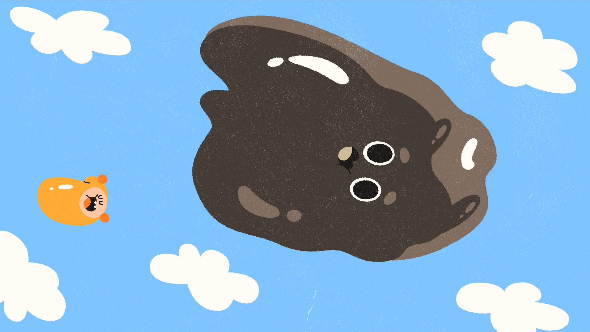
盡可能在美術階段多畫一些表情,方便後續動畫表現活生生的角色存在感。
During the art development stage, we created as many facial expressions as possible. This gave the animation team a wider range of emotional cues to work with and helped strengthen the sense of a lively, believable character on screen.


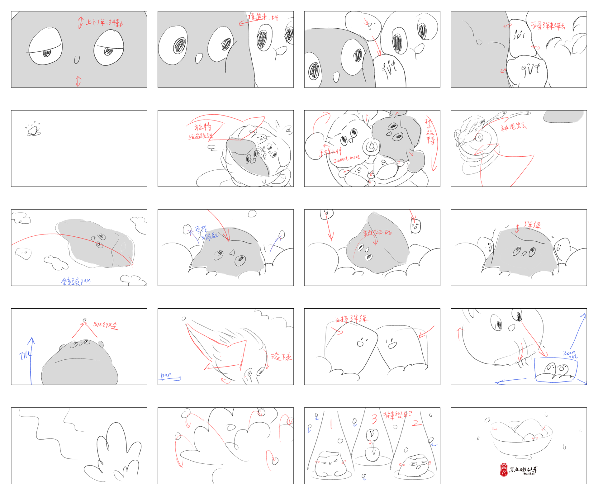
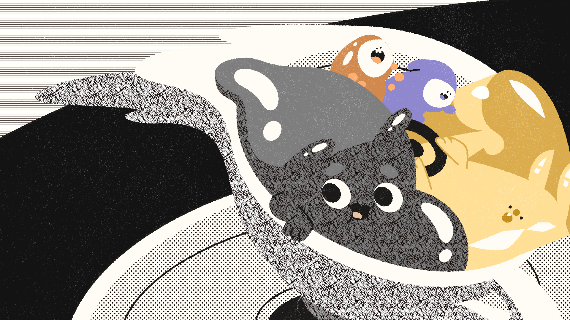
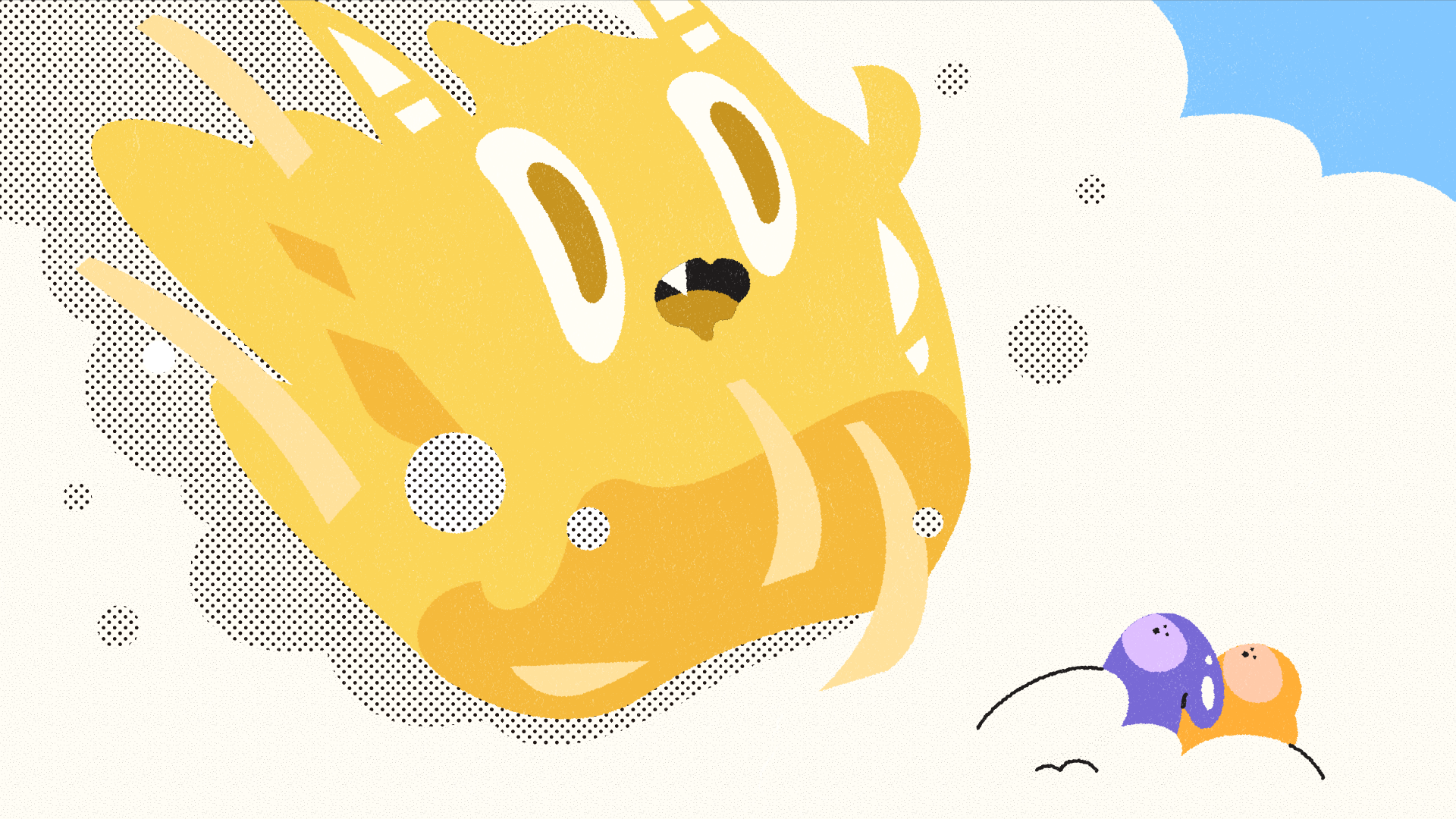
動態上則以各部位時間差與擠壓感,特別著重呈現角色 Q 彈的細節,並加入拖尾效果強調移動的速度。
整體節奏特別注意緩急對比,讓表演更能順利被看清楚,畢竟可愛就是要讓人看清楚。
For animation, we focused on timing offsets and squash-and-stretch to highlight the characters’ bouncy qualities and emphasize every soft, jiggly detail. We also incorporated smear frames to enhance the sense of speed and make each movement feel more dynamic.
We paid close attention to overall pacing as well, balancing slower and faster moments so every expression and action could be clearly read. Because let’s be real—if it’s cute, you don’t want anyone missing it.

– Credit
Client / 黑堂有限公司
Production House / 無厘頭動畫股份有限公司
Client / 黑堂有限公司
Production House / 無厘頭動畫股份有限公司
Director / 劉怡萱
Script / 劉怡萱
Storyboard / 劉怡萱
Art Director / 劉怡萱
Styleframe / 劉怡萱
Art Design / 許芳瑜、劉怡萱
Motion Board / 花國書
Motion Design / 花國書、劉欣頤、鄭光辰
Creative Direction / 賴麒文
Creative Proposal / 賴麒文、張雅雯、曾揚智、張家維、黃姿瑋、楊容
Project Manager / 楊容
Account Manager / 張家維
Creative Proposal / 賴麒文、張雅雯、曾揚智、張家維、黃姿瑋、楊容
Project Manager / 楊容
Account Manager / 張家維